Content & systems
Conversion optimisation
Conversion work examines the gap between arriving and acting. I review intent, page clarity, trust and form or checkout friction before recommending changes to test.
Enquire about this service ↗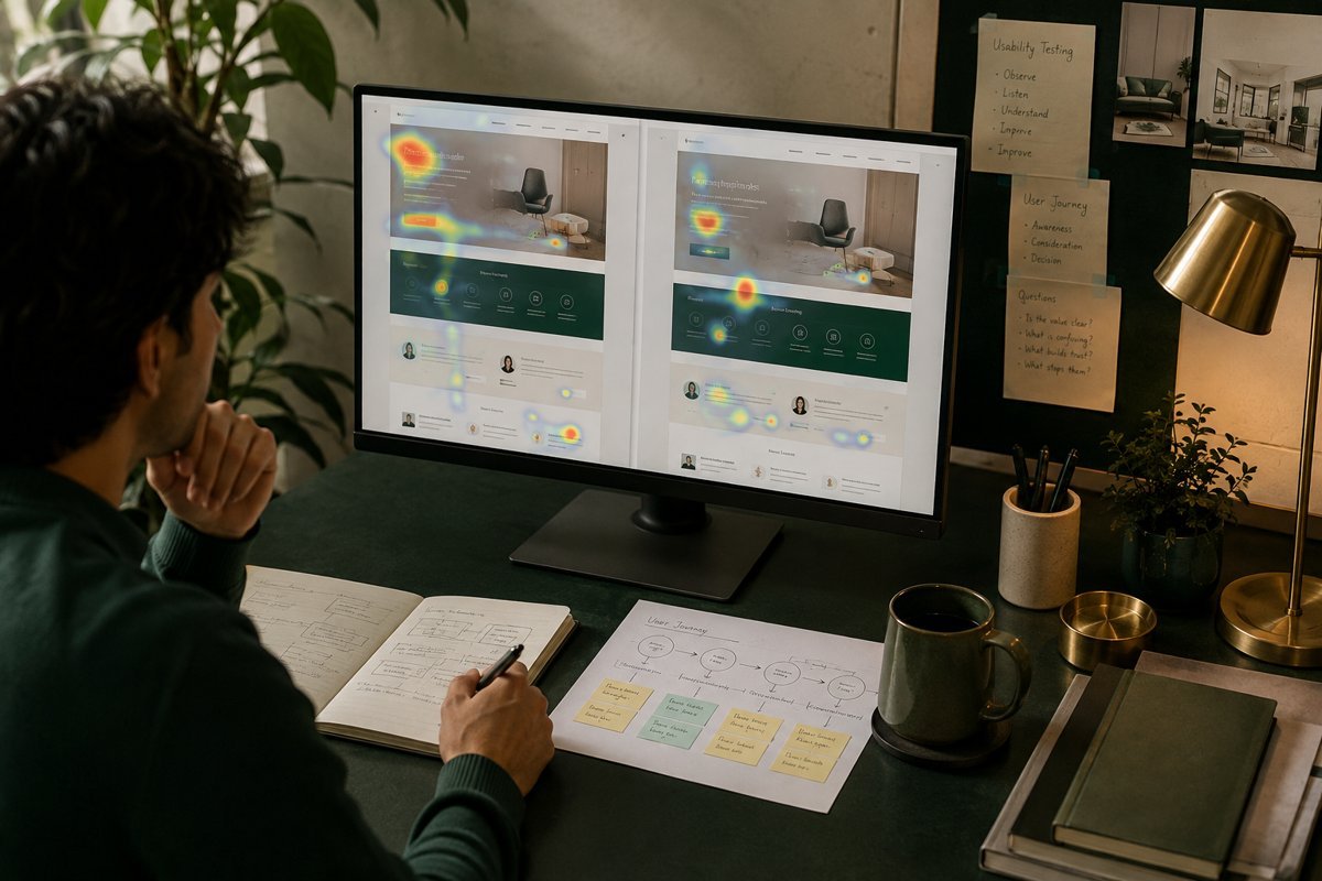
HOW I CAN HELP
Help visitors take the next step.
Landing-page and form priorities
Measurement and testing direction

THE APPROACH
From the brief to a clear direction.
Yes. I can review the offer, page clarity, forms and customer journey to identify friction and prioritise improvements.
Key pages, conversion definitions and available performance data.
THE APPLICATION
Built around the way you work.
Not necessarily. The right approach depends on traffic and reliable measurement. We can use research, usability review or controlled tests where there is enough data.
Discuss your briefConversion work starts from a simple observation: people arrive with a reason, and something on your pages either helps them act or gets in the way. I look for that something, rank what I find, and recommend changes you can test or simply make. No headline tricks, and no testing for the sake of it.
Define the conversion before touching the page
The first question is what counts as a conversion for this business. A form submission? A phone call? A booking, a quote request, a purchase? Often there are several, with very different values, and the site treats them all alike.
I write the definitions down, check that they are tracked correctly, and note which ones happen online versus offline. A phone call that never gets logged is a conversion that does not exist as far as the report is concerned.
If tracking is unreliable, I say so before drawing conclusions. This sometimes means starting with analytics and automation work, because optimising against bad data produces confident mistakes.
Understand intent before judging the design
A page cannot be assessed without knowing who lands on it and why. Someone clicking a branded search ad is in a different position from someone arriving from a broad article. I segment traffic by source, device and landing page, then look at what each group does.
This usually reveals that one or two entry points carry most of the volume, and that mobile visitors behave very differently from desktop. Those become the priorities.
I also read the questions your sales team hears, the search terms people used, and any chat or enquiry messages. These tell me what visitors were trying to find out, which is the best guide to what the page is missing.
Seasonal and campaign-driven visitors need separate treatment. Traffic from a one-off promotion behaves differently from steady organic traffic, and mixing them can hide a real problem or invent a false one. I look at periods and sources separately, then combine only what is genuinely comparable. It is a small discipline, and it prevents some of the worst misreadings.
What I review on the page
I go through each priority page as a first-time visitor and note where I hesitate. Is the offer clear in the first screen? Does the page prove its claims? Is the next step obvious and proportionate? Are there things that would make me abandon it: slow loading, intrusive popups, unclear pricing, a form that asks too much?
Findings are recorded with evidence and a note on how confident I am. Some problems are plain, such as a button that does not work on a particular phone. Others are hypotheses that need testing.
- Clarity: can a visitor say what is offered, for whom, within a few seconds?
- Trust: are there credentials, real proof, contact details and policies that reassure?
- Friction: forms, steps, required fields, load time, mobile layout.
- Relevance: does the page match the ad, search result or link that sent the visitor?
- Next step: is it visible, specific and appropriate to where the visitor is in their decision?
Forms and checkout deserve separate attention
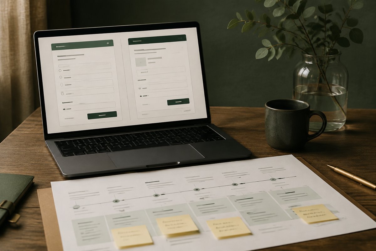
Forms are where interest turns into a lead, and also where many are lost. I look at the number of fields, their order, error messages, what happens after submission and whether the information collected is actually used. Every field should earn its place.
For stores, the same logic applies to the cart and checkout: surprise costs, forced account creation, limited payment options and unclear delivery information are common causes of abandonment.
Where the form feeds a CRM or inbox, I also check what happens next. A fast, well-designed form that lands in an unmonitored mailbox is no use to anyone.
Testing, research and when to do which
A/B testing is useful when you have enough traffic and conversions to read a result with confidence, and a hypothesis worth testing. Many small and mid-sized sites do not, and a test that runs for weeks on thin data often ends with no real answer.
In those cases I rely on usability review, session recordings, heatmaps, customer interviews and sensible implementation of well-established practice, then watch the before-and-after trend with appropriate caution. Where testing does make sense, I set the hypothesis, the success measure and the stopping rule before the test begins.
What I avoid is calling something a win because a number moved over a few days.
What you receive
A prioritised list of findings with the evidence behind each, a recommended order of work based on likely impact and effort, and specific copy, layout or form changes where I can give them. For testable ideas, a test plan with the hypothesis and how success will be judged.
Depending on the scope, I can also brief your designer and developer, review the changes before they go live, and check the results with you afterwards. The timeline depends on how many pages are involved, how much data exists, and how quickly changes can be implemented on your side.
I also try to be specific about effort. A recommendation that sounds small, such as rewriting a headline, may be trivial, while one that sounds modest, such as changing the checkout, may involve developers and payment providers. Each item is tagged so you can plan realistically and choose the changes that fit your resources.
Where findings need a decision from you, I flag them separately. Examples include changing a price display, removing a field that sales relies on, or altering a promise the business has made. These are not purely design questions, and I would rather you decide knowingly than discover a change later and wonder who approved it.
Common mistakes I see
Changing a page because someone senior dislikes the colour is the most frequent one. The second is copying what another site does without knowing whether it works for them. The third is running several tests at once on the same traffic, which makes results impossible to read.
There is also a habit of treating the homepage as the main page when most conversions come from service, landing or product pages. I look at where visitors actually enter and act, and begin there. A polished homepage that few people use for decisions is a poor place to spend effort.
- Redesigning without first knowing what is wrong with the current page.
- Stopping a test the moment it looks positive.
- Adding more calls to action when the real issue is unclear value.
- Ignoring mobile, where a large share of visitors often arrive.
- Optimising pages while enquiries sit unanswered.
Making changes safely
Not every change deserves a test, and not every change is safe to make quickly. I separate fixes that are plainly right, such as a broken form or unreadable text, from changes that are judgement calls. The first group goes live immediately. The second group is staged, tested or watched carefully.
Before and after any change, I record the baseline, the date and the expected effect. That sounds fussy, but without it you cannot tell later whether a movement in the numbers was caused by the change or by a seasonal shift, an ad campaign or something else entirely.
Where it fits and when to skip it
Conversion work pairs naturally with content and copywriting, since many problems turn out to be wording, and with paid media, since paying for traffic to a weak page wastes the budget. It also depends on analytics and automation for reliable measurement.
If a page gets very little traffic, optimising its layout will change little; the first job is bringing in the right visitors. And if the offer itself is not competitive, no page fix will cover that. I would tell you so directly.
Find where visitors hesitate, fix the obvious, and test only what you have the traffic to measure.
WAYS TO WORK TOGETHER
A focused project. Or ongoing support.
Start with a strategy session. We can then agree a project brief, a focused consultation or an ongoing engagement around your priorities.
YOUR QUESTIONS, ANSWERED
Conversion optimisation FAQs
Scope, preparation and what happens next.
Can you help when traffic is not turning into enquiries?
Yes. I can review the offer, page clarity, forms and customer journey to identify friction and prioritise improvements.
Will every change be an A/B test?
Not necessarily. The right approach depends on traffic and reliable measurement. We can use research, usability review or controlled tests where there is enough data.
What should I prepare for our first conversation?
Key pages, conversion definitions and available performance data.
How are the scope and timeline agreed?
I review your requirements, starting material and target date before proposing milestones. For conversion optimisation, the schedule depends on complexity, review rounds and the access or assets needed.
How much does this service cost?
Start with a strategy session at ₹2,999 + GST. A digital audit starts from ₹19,999 + GST, and ongoing monthly options start at ₹50,000 + GST for SEO consulting or ₹75,000 + GST for a consulting retainer. Project delivery is scoped and quoted separately; we can choose the right arrangement for your brief.